Creative Website Design
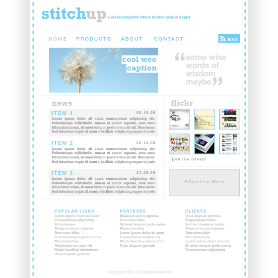
Preview of Final Results

Design a Web Template using the “960 Grid System” Photoshop Tutorial
Step 1
Whenever I’m mocking up a web template in Photoshop I use a generic grid called the ’960 Grid System’. This grid system has become very popular in web design, however I still believe that grid systems like this shouldn’t be followed too strictly so the main reason I use this system is because the PSD files come with lots of guides set up already which saves a lot of time. So I’d advise downloading the grid system free from here. Once you’ve downloaded it open the 12 column PSD file in Photoshop and you should have something that looks like the image below.

Step 2
Try turning the guides on if they aren’t already; do this by going View>Show>Guides and View>Snap_To>Guides. Below you’ll see that I’ve drawn a rectangle showing the container where all the content will go, you don’t need to draw this rectangle as the background will be whit anyway but if it helps then go for it.

Step 3
Create a new layer then select the gradient tool and choose a gradient going from white to black. Holding shift drag horizontally to get a gradient looking like the image below, you may have to try a few times to get it right.

Step 4
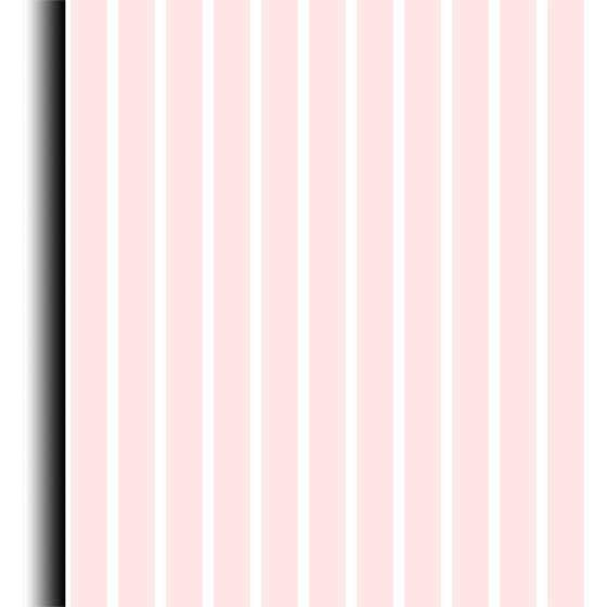
Select the rectangular marquee tool and drag from the top left corner down to the bottom and snapping to guide which was at the left side of the box shown in step 2. Now go Layer>Layer Mask>Reveal Selection and you should be left with something that resembles the image below.

Step 5
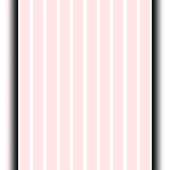
Repeat the last two step again for the other side and make sure its symmetrical.

Read more at http://photoshoptutorials.ws/photoshop-tutorials/layouts/design-web-template-960-grid-system/#OzbtSy6sOjlkYfhM.99
Courtesy: http://photoshoptutorials.ws/photoshop-tutorials/layouts/design-web-template-960-grid-system/
0 comments:
Post a Comment